1) Visual Narrative – use your 10 images to tell a story using no words.
2) The end of the world – is it a place or an event?
3) 10 favourite songs – a compilation album.
4) 10 Images and Texts – consider carefully the relationship between the visual and the written.
5) 10 Portraits in the style of August Sander or Rineke Dijkstra or early Thomas Ruff.
6) Yourself.
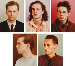
I chose number 5 to take 10 portraits in the style of Thomas Ruff. I recently looked into his work, and found them breath taking in a way. They are simple portrait photographs of the top half of the body, viewing like a passport photo. e.g:
To achieve this, i will look in more depth of his work and his equipments and techniques. I would also really like to achieve the old fashioned style, and colour within the photos of which Thomas Ruff tried to show a neutral expression along. By doing this I will also dress the sitters in neutral colours and edit the photographs at the end to make it look old fashioned.
In 1981, Thomas Ruff began a series of colour portraits of his friends and fellow students at the Dusseldorf Academny, so to start off I will begin my series of portraits using my friends and family and friends from Bath Spa University.
What makes these photo's breath taking is the fact they have no facial expression. They must have been told not to smile and look at the camera in some cases. They are positioned either face on to the camera, side view, or at an angle with their legs facing the photographer but their shoulders are facing a different direction, against a white or plain coloured background.
I am really looking forward to this project, and feel just simply photographing portraiture can really help me in the long run with photography in the real world, as portraiture is taken many times and be used for many reasons, such as magazines and advertisement.
I thought about my photography project and wanted to get a start on my ten series of photos, so I started off by capturing myself and my sister. I took the photos in different views, the photo of me on the left is a more close up than the photo on the right. I was also experimenting with the editing, adjusting hue/saturation, brightness/contrast, and adding effects such as a Gaussian blur, noise, grain etc.
 |
| x |


No comments:
Post a Comment